|
|
|
URL: http://www.foxyroxysails.com Pages: 13 Captain Randy Pritchard needed a bold, nautical-themed web site for his new charter sailboat business. PulsePoint Design rose to the challenge with this fun, professional design. We created a ship’s wheel based logo for the header, and drew in the sounds of waves and seagulls to give site visitors a taste of the sea. Then we created a customized reservation system, and added a full moon chart, interactive sailboat exploration page, and zip-code based weather report to complete the site. |
|
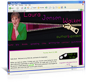
URL: http://www.laurajensenwalker.com Pages: 10 Author and speaker Laura Jensen Walker needed a full remodel for her home online, from basic blue to a vibrant, interactive site that highlighted her spunky sense of humor and delightful new chick-lit fiction books. PulsePoint Design rose to the challenge with a fun, funky, fashion-oriented site, complete with Flash design, a customized stripe background, and trendy sidebar images. Bright colors of lime green, fuchsia, and purple, a rotating thought of the day box, and chunky, modern fonts complete this marvelous design. |
|
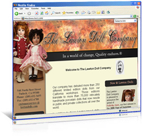
URL: http://www.lawtondolls.com Pages: 115+ Master artist Wendy Lawton needed a complete redesign for her world-renowned doll company, with a new layout that honored the Lawton Doll heritage while moving it forward into the world of modern doll collecting. PulsePoint Design responded with a warm, professional site draped in rich colors of mauve, rose, gold, and gray. A customized drop-down navigation system, and sidebars featuring Lawton’s latest news and newest doll release give this site its winning, professional look. |
|
Site: Aotearoa Editorial Services URL: http://www.aotearoaeditorial.com Slogan: Where Polished Prose Is Our Passion Pages: 6 Senior Editor Vennessa Ng wanted a crisp, natural site, with a customized slogan, fresh colors, and a design that highlighted the company’s New Zealand location. PulsePoint Design used a native-to-New-Zealand Maori print for the site’s navigation bar and border. Elegant fonts, clean pages, and a header image enhanced with waves that ebb and flow offer visitors a taste of New Zealand while highlighting Aotearoa’s editorial services.
|
|
Site: Jodie Westfall Photography URL: http://www.jodiewestfallphotography.com Slogan: Capturing Life Unscripted Since 1997 Pages: 6 Photographer Jodie Westfall wanted a clean, professional site with a customized slogan, logo, and a design that would stand out from other photography web sites. PulsePoint Design created a film-strip site border, and wrapped it in contrasting colors of black, white, and royal purple. A rotating image box, special camera favicon, Flash photo portfolio, camera navigation buttons, and a client sign-in page complete this site’s strong, photo-oriented theme.
|
|
Site: Author Annette Smith URL: http://www.annettesmithbooks.com Pages: 5 Author Annette Smith wanted a contemporary site with a southern flair, a matching blog, and easy-to-view sample chapters from her latest books. PulsePoint Design created a site style of deep pomegranate red, pine green, and soft honey to compliment Annette’s warm personality and writing voice. A customized blog-excerpt box, rotating Flash box featuring Annette’s latest books, and a specialized notebook-style contact form finish off this site’s classy, welcoming design.
|
|
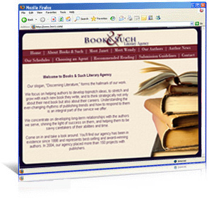
Site: Books & Such Literary Agency URL: http://www.booksandsuch.biz Pages: 11 Books & Such Literary Agency wanted to update their old site with a warm, professional new design that included a rounded-corner layout, custom navigation interface, Flash client testimonial box, specialty writing and publishing photo images, and a contemporary, literary theme. PulsePoint Design created a rich, easy-to-navigate layout for this site with special touches including paper clipped photo images of each agent, old typewriter font headers, and fantastic book, typewriter, and calligraphy images to each page the perfect literary feel.
|
|
Site: Focus on Fiction URL: http://www.focusonfiction.net Slogan: Christian Fiction for Discerning Readers! Pages: 110+ The Focus on Fiction team needed a professional, easy to navigate interface, with customized logo, slogan, graphics, and background. PulsePoint Design created a site with rich blue and gold accents for a classic, professional look. Customized push-pins, a unique snapshot frame for feature authors, and torn notepaper graphics gave the site its literary feel.
|
|
Site: Author Pamela Dowd URL: http://www.pameladowd.com Slogan: Sharing His heart, one page at a time Pages: 14 Author Pamela Dowd wanted a warm site, a customized slogan, and navigation bar that reflected a ‘cafe’ theme. PulsePoint Design used several latte colors for Pamela’s slogan bar, then juxtapositioned cobalt blue mugs against a cranberry-hued navigation bar to contribute to the site’s cafe ambiance.
|


|
| Home | About Us | Services | Portfolio | Clients | Contact Us | © PulsePoint Design, 2002-2013 All rights Reserved All web design and graphic design images and text on this site are protected by copyright and trademark laws. You may not copy, modify, sell, distribute, transmit, display, reproduce, publish, or license any images or text from this site without the express written permission of PulsePoint Design. |
 Site: Foxy Roxy Charter Sailboat Company
 Site: Author Laura Jensen Walker
 Site: The Lawton Doll Company


